
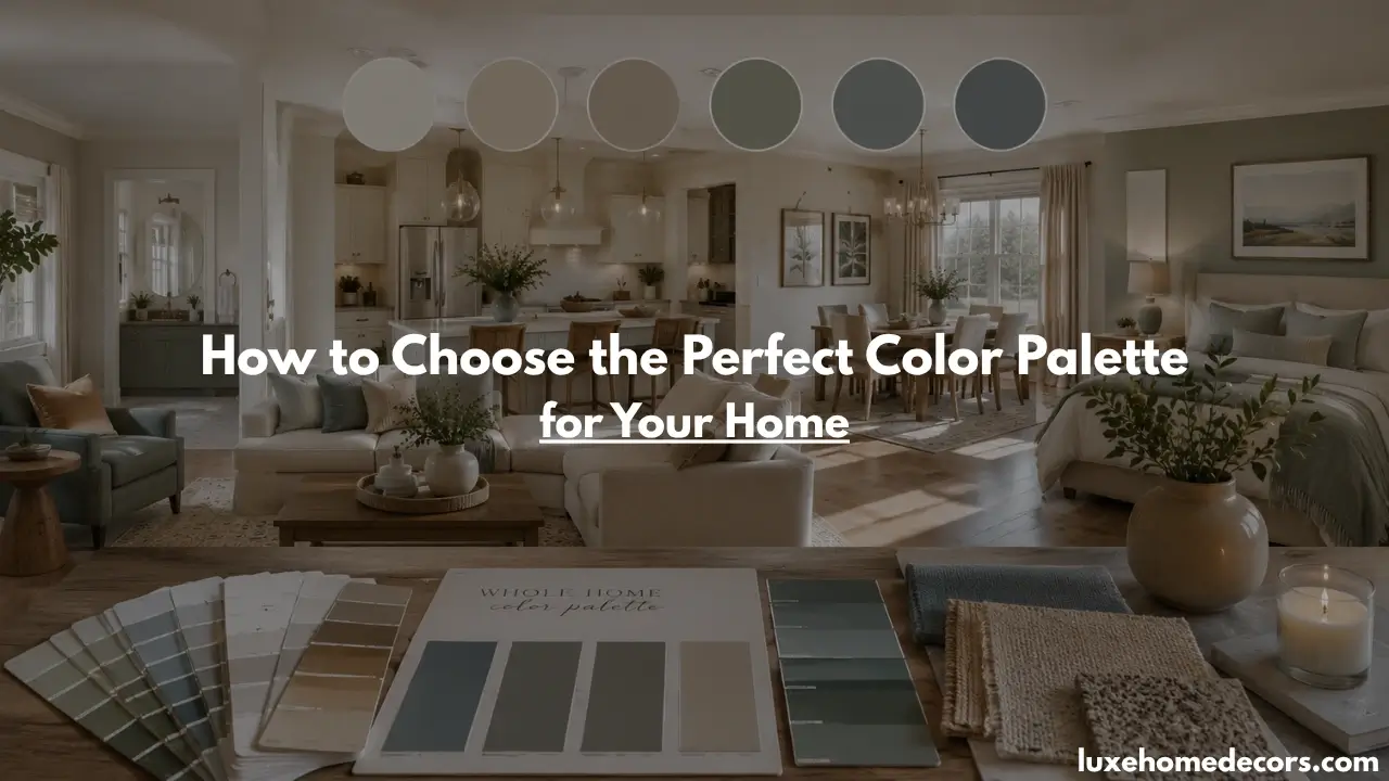
Choosing the perfect color palette for your home can have a bigger impact than you might think. Blue is the world’s favorite color, chosen by 57% of men and 35% of women across different age groups and backgrounds.
The right color palette can make rooms feel larger, brighter, cozier, or more inviting, while the wrong color scheme can leave your home feeling disconnected and unbalanced.
With thousands of paint colors available, choosing a color palette for your home can quickly become overwhelming. Should you use neutral shades, warm tones, jewel tones, or complementary colors? The key is creating a cohesive color scheme that flows naturally throughout your home.
By understanding color relationships, lighting, and room function, you can confidently choose the perfect color palette for your home and create a stylish, balanced space that reflects your personality and design goals.
- Start with a Color You Love When Choosing a Color Palette
- Understanding Color Scheme Basics Before Choosing a Color Palette
- How to Create a Cohesive Whole House Color Palette
- Choosing the Right Color Palette for Every Room
- How to Use Accent Color for a Balanced Look
- Factors That Affect Choosing a Color Palette
- Benjamin Moore and Popular Interior Paint Color Ideas
- Common Mistakes to Avoid When Choosing a Color Palette
- Frequently Asked Questions About Choosing a Color Palette for Your Home
- Conclusion
Start with a Color You Love When Choosing a Perfect Color Palette

One of the easiest ways to choose a color palette for your home is to start with a color you already love. Instead of looking through hundreds of paint samples, focus on shades that make you feel comfortable and happy. A favorite color can become the foundation of a cohesive color scheme and make decorating decisions much easier. Once you identify a color you love, you can build the rest of your home color palette around it.
How to Find a Color You Love
Finding a color you love is often easier than you think. Look around your home for inspiration in artwork, rugs, furniture, throw pillows, or decorative accessories. Nature can also provide beautiful color combinations, from calming greens to warm sunset tones. Pay attention to the colors that repeatedly catch your eye, as they often reflect your personal style and help guide your color palette choices.
Using One Color as the Foundation
After choosing a color you love, use it as the starting point for your home color palette. This doesn’t mean every room should be painted the same shade. Instead, use different tones, complementary colors, and coordinating accents that work with your chosen color. Building your color scheme around one color creates consistency and helps every room feel connected throughout your home.
| Color Preference Ranking | Men | Women |
|---|---|---|
| 🔵 Blue dominates as the clear favorite | 57% | 35% |
| 🟢 Green earns equal popularity | 14% | 14% |
| 🟣 Purple is strongly preferred by women | 1% | 23% |
| 🔴 Red attracts moderate interest | 7% | 9% |
| ⚫ Black remains a timeless choice | 9% | 6% |
| 🟠 Orange is the least selected color | 5% | 3% |
Understanding Color Scheme Basics Before Choosing a Color Palette
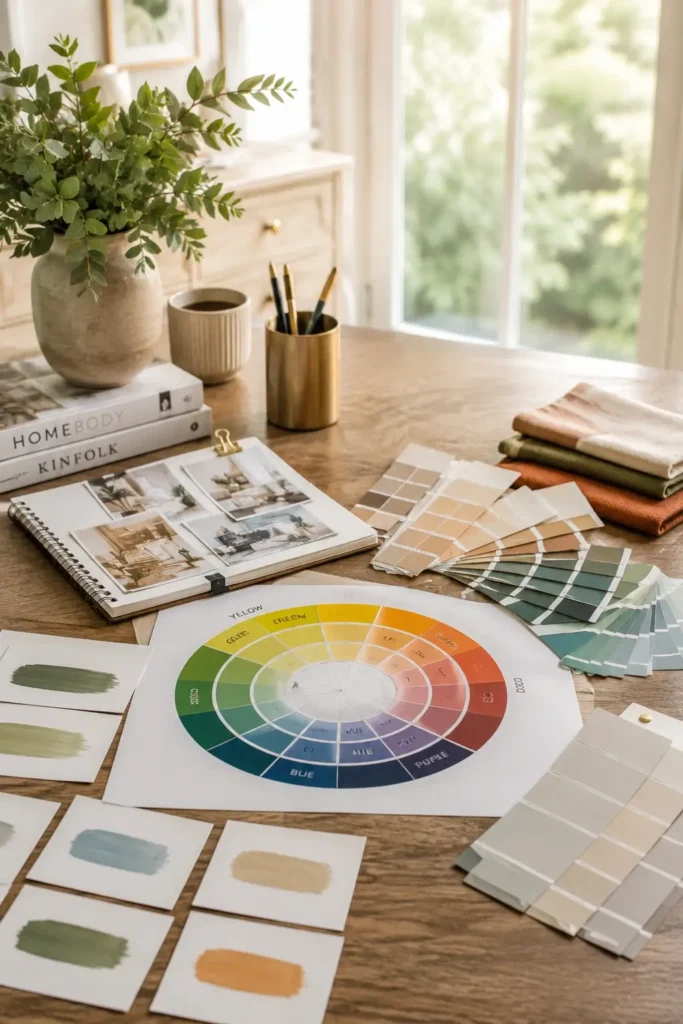
Before choosing a color palette for your home, it helps to understand a few basic color scheme principles. The right combination of colors can make a space feel balanced, inviting, and visually appealing. Learning how neutral shades, complementary colors, and accent tones work together will make it easier to create a cohesive color palette that flows naturally throughout your home.
Neutral Colors for a Timeless Color Scheme
Neutral colors are the foundation of many successful home color palettes. Shades like white, beige, greige, and soft gray create a clean and timeless backdrop that works with almost any decorating style. Neutral colors also make it easier to update your space over time because they pair well with different furniture, artwork, and accent colors. This versatility is why neutral shades remain a popular choice for every room in the home.
Complementary Color vs Complementary Color Scheme
A color wheel can be a valuable tool when choosing a color palette. Complementary colors sit opposite each other on the color wheel and create contrast that adds energy and interest to a room. A complementary color scheme uses these color relationships while maintaining balance, ensuring the space feels vibrant without becoming overwhelming. When used correctly, complementary colors can highlight architectural features and create a more dynamic interior.
Warm Tones, Jewel Tones, and Airy Shades
Different color families create different moods within a space. Warm tones such as beige, terracotta, and soft gold add comfort and coziness, making them ideal for living rooms and gathering spaces. Rich jewel tones like emerald green, sapphire blue, and deep plum bring depth, character, and a sense of luxury. For a brighter look, airy shades such as soft whites, pale blues, and light grays help rooms feel larger, fresher, and more open.
How to Create a Cohesive Whole House Color Palette
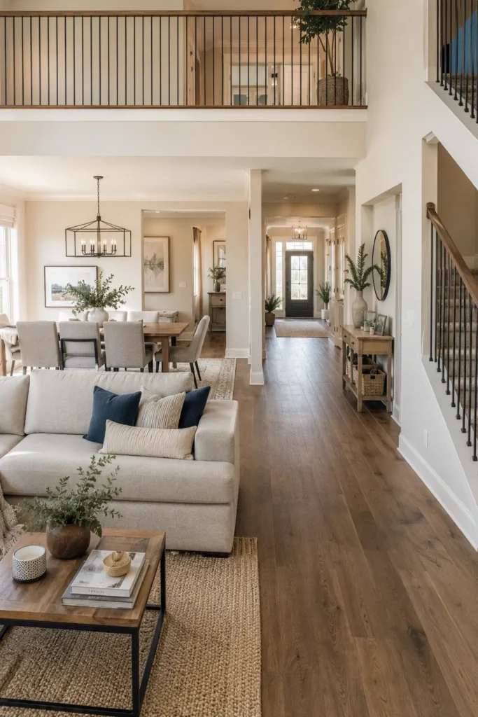
A cohesive whole house color palette helps every room feel connected and intentional. Instead of choosing colors for each room separately, think about how the spaces work together. A well-planned color scheme creates visual flow, makes transitions between rooms feel natural, and gives your home a polished and balanced appearance.
Planning a Whole House Color Scheme
When creating a whole house color scheme, it’s important to consider the home as a complete space rather than a collection of individual rooms. Since hallways, doorways, and open floor plans often reveal multiple rooms at once, the colors should complement one another. Choosing colors without a plan can make your home feel disconnected, while coordinated shades help create a more cohesive and welcoming environment.
Creating Flow Throughout Your Home
One of the easiest ways to create flow throughout your home is by repeating colors in different areas. This could be a wall color, accent shade, or decorative detail that appears in multiple rooms. Repeating colors creates consistency and helps guide the eye naturally from one space to another. Even subtle color connections can make the entire home feel more harmonious and thoughtfully designed.
Mix and Match Colors Without Losing Cohesion
A cohesive home color palette doesn’t mean every room needs the same color. Instead, combine neutral shades with carefully chosen accent colors to add variety while maintaining balance. Soft neutrals can provide a consistent foundation, while accent shades bring personality and interest to each space. This approach allows every room to have its own character while still contributing to a unified look throughout the home.
Choosing the Right Color Palette for Every Room
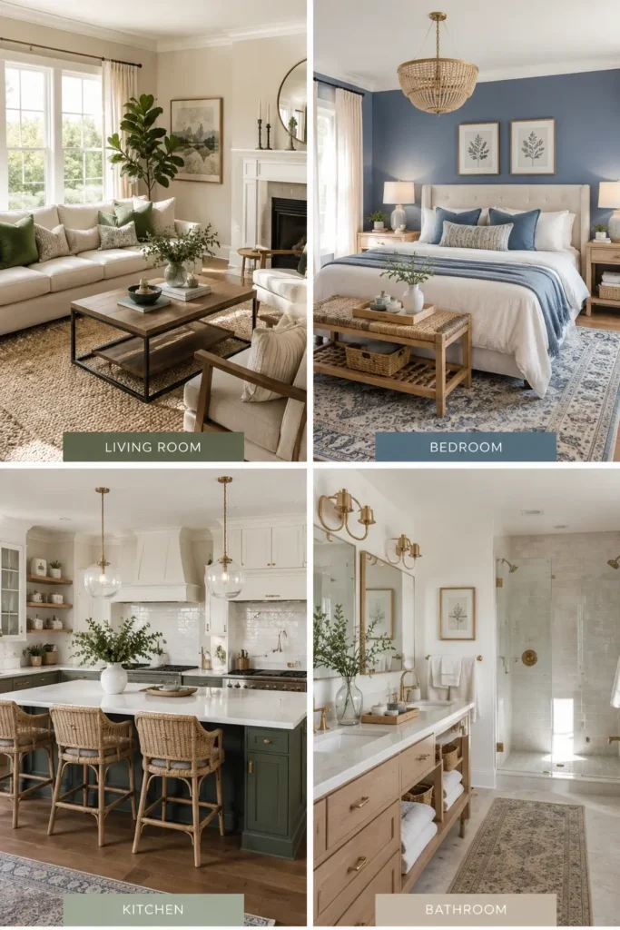
Every room in your home serves a different purpose, so the color palette should reflect how the space is used. While maintaining a cohesive color scheme throughout your home is important, each room can benefit from colors that support its function and desired atmosphere. Choosing the right colors for every room helps create spaces that feel comfortable, inviting, and visually balanced.
Living Room Color Palette Ideas
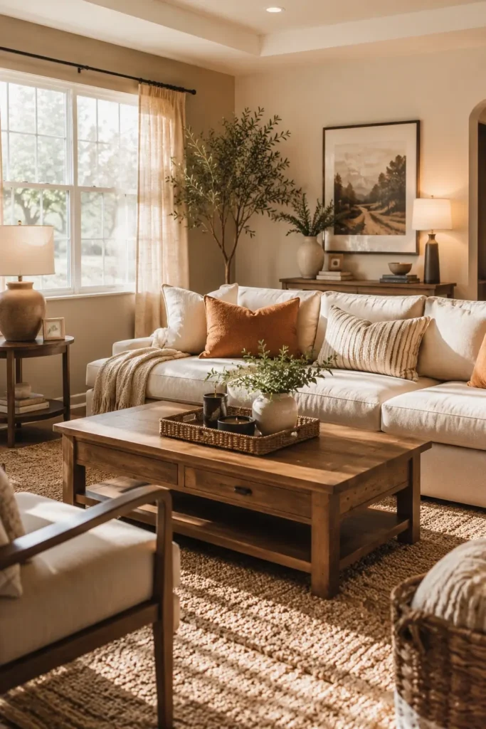
The living room is often the heart of the home, making warm and welcoming colors a popular choice. Soft beige, warm gray, creamy white, and earthy tones create a comfortable atmosphere that encourages relaxation and conversation. You can also add accent colors through pillows, artwork, and decor to bring personality and depth to the space while keeping the overall look balanced.
Bedroom Color Palette Ideas
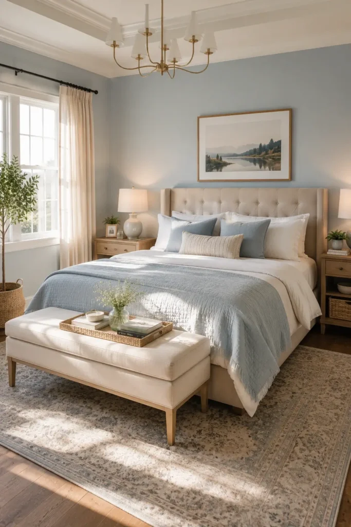
Bedroom color should feel calm, peaceful, and relaxing. Soft blues, muted greens, gentle grays, and warm neutrals are popular choices because they create a soothing environment that promotes rest. Layering different shades of the same color can add visual interest while maintaining a serene and comfortable atmosphere.
Kitchen and Dining Room Color Schemes
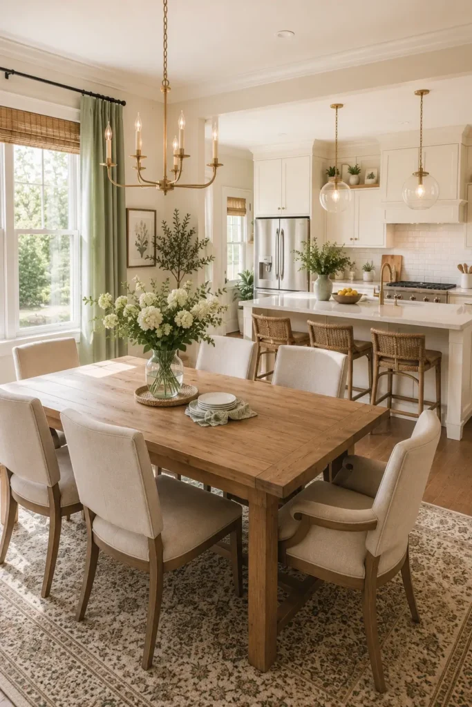
Kitchens and dining rooms benefit from colors that feel bright, welcoming, and full of energy. Warm whites, soft yellows, muted greens, and natural wood-inspired tones can create an inviting space for cooking and gathering. The goal is to use colors that feel lively without becoming overwhelming, helping the room remain both functional and stylish.
Bathroom and Home Office Color Palettes
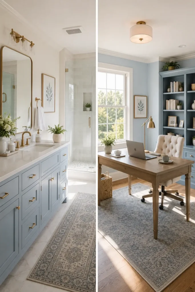
Bathrooms and home offices often benefit from fresh and calming color palettes. Soft whites, light blues, pale greens, and subtle gray tones can make bathrooms feel clean and spa-like. In a home office, these same shades can support focus and productivity while creating a comfortable workspace. Choosing colors that feel balanced and uncluttered helps both spaces feel more functional and enjoyable.
How to Use Accent Color for a Balanced Look
Accent colors are a simple way to add personality and visual interest to your home without overwhelming the space. While neutral colors often provide the foundation of a color palette, accent colors bring energy, contrast, and character. When used thoughtfully, they can enhance a room’s design and help create a balanced, cohesive look.
Choosing the Right Accent Color
The right accent color should complement your existing color palette while adding a touch of personality. Consider colors that work well with your walls, furniture, and overall design style. Whether you prefer a bold jewel tone or a softer shade, the goal is to create contrast without overpowering the room. A carefully chosen accent color can become a focal point and bring the entire color scheme together.
Using Color Through Accessories and Decor
You don’t need to paint an entire wall to introduce color into a room. Accent colors can be added through decorative accessories such as pillows, artwork, rugs, lighting fixtures, and furniture pieces. These smaller elements allow you to experiment with color while keeping the space flexible and easy to update. It’s also a great way to add seasonal or trendy colors without making a long-term commitment.
Mixing Accent Colors with Neutral Interiors
Neutral interiors provide the perfect backdrop for accent colors. Shades like white, beige, greige, and soft gray allow colorful accessories and decor to stand out while maintaining a clean and timeless appearance. Mixing accent colors with neutral foundations creates depth, visual interest, and balance, making the room feel more layered and thoughtfully designed without appearing cluttered.
Factors That Affect Choosing a Color Palette
Choosing a color palette involves more than simply picking shades you like. Several factors can influence how colors appear and feel within a space, including lighting, room size, and existing interior features. Taking these elements into account can help you select colors that look beautiful in your home and create a balanced, cohesive design.
Natural Light and the Golden Hour Effect
Lighting has a major impact on how paint colors look throughout the day. Natural sunlight changes from morning to evening, while the warm glow of the golden hour can make colors appear softer and richer. Artificial lighting can also affect color perception. Before committing to a paint color, test samples on different walls and observe them at various times of the day to ensure they look the way you expect in all lighting conditions.
Room Size and Interior Paint Selection
The size of a room can influence which colors work best. Light and airy shades such as soft white, pale gray, and light beige can make smaller rooms feel larger and more open. In larger spaces, darker colors can create a sense of warmth and intimacy by making the room feel more inviting. Choosing the right interior paint color can help enhance the proportions and overall atmosphere of any space.
Existing Interior Features
When selecting a color palette, it’s important to consider the features that will remain in the room. Flooring, cabinets, countertops, fireplaces, trim, and other fixed elements all contribute to the overall design. Your paint colors should complement these existing finishes rather than compete with them. Looking at undertones and coordinating colors carefully can help create a harmonious and well-designed space.
Benjamin Moore and Popular Interior Paint Color Ideas
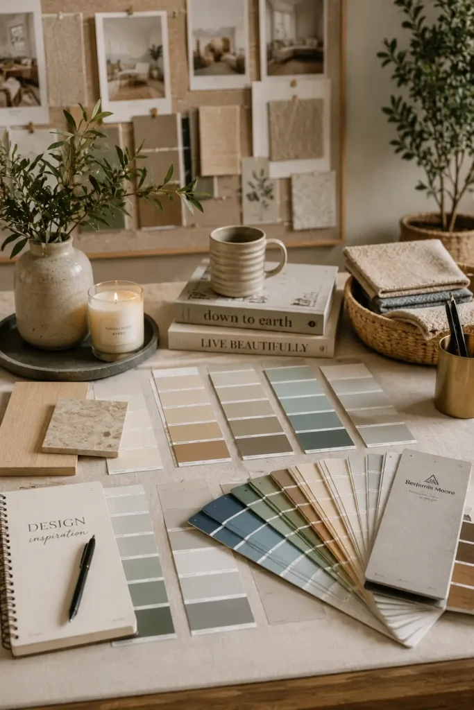
Choosing the right interior paint color can make a significant difference in the overall look and feel of your home. Many homeowners turn to trusted paint brands for inspiration when creating a cohesive color palette. From timeless neutral shades to modern earthy tones, today’s most popular paint colors offer versatility, style, and long-lasting appeal.
Popular Benjamin Moore Neutral Paint Colors
Benjamin Moore is known for its wide range of neutral paint colors that work beautifully in almost any room. Shades such as soft white, warm beige, greige, and light gray provide a timeless foundation for a cohesive home color palette. These versatile colors complement a variety of design styles and make it easier to coordinate furniture, decor, and accent colors throughout your home.
Trending Interior Paint Colors for Modern Homes
Modern homes are embracing warm neutrals, earthy hues, and soft color palettes that create inviting and comfortable spaces. Colors inspired by nature, including warm taupe, sage green, clay tones, and muted blues, continue to grow in popularity. These shades add character and depth while maintaining a balanced and sophisticated look, making them ideal for homeowners who want a fresh yet timeless interior design.
Common Mistakes to Avoid When Choosing a Color Palette
Avoiding a few common mistakes can help you create a color palette that looks balanced and works well throughout your home.
Using Too Many Colors in One Home
- Using too many colors can make your home feel busy and cluttered.
- Limit your main color palette to 5 or 6 colors.
- Repeat colors in different rooms to create consistency.
- Use accent colors instead of introducing a completely new color in every room.
Ignoring Natural Lighting
- Paint colors can look different throughout the day.
- Natural sunlight may make colors appear brighter.
- Dark rooms can make colors look deeper or duller.
- Always test paint samples before making a final decision.
Forgetting About Color Flow Throughout Your Home
- Colors should connect from room to room.
- Consider how adjacent spaces look together.
- Use similar tones or complementary colors for a cohesive feel.
- Hallways and open spaces should help tie the color scheme together.
Choosing Trendy Colors Instead of the Right Color
- Trends change quickly, but your home color palette should last for years.
- Choose colors that match your style and lifestyle.
- Focus on colors you genuinely love rather than what’s currently popular.
- Use trendy shades in accessories and decor if you want flexibility.
Frequently Asked Questions
How Many Colors Should Be in a Home Color Palette?
Most homes look best with 3 to 6 main colors. This creates variety while keeping the overall design cohesive.
How to Choose the Perfect Color Palette for Your Home?
A whole house color scheme usually combines neutral colors with a few accent shades that flow naturally from room to room.
How Do You Create a Cohesive Color Palette for Interior Design?
Choose a main color, add complementary shades, and repeat key colors throughout your home for a balanced look.
Should Every Room Have the Same Color Scheme?
No. Each room can have its own personality, but the colors should coordinate to maintain visual flow throughout the home.
How Do Complementary Colors Work in Interior Design?
Complementary colors sit opposite each other on the color wheel and create contrast while keeping the room balanced and visually appealing.
Conclusion
Choosing the perfect color palette for your home may seem difficult at first, but it becomes much easier when you take it step by step. Start with a color you love, consider your lighting, choose complementary shades, and create a color scheme that flows throughout your home. Remember that neutral colors, accent colors, and thoughtful color combinations all play a role in creating a balanced look.
Don’t worry if you don’t get everything right the first time. Paint is one of the easiest things to change, and testing colors before making a final decision can help you avoid costly mistakes. The most important thing is to choose colors that make you feel comfortable and happy in your space. A cohesive home color palette will help every room feel connected, welcoming, and beautifully designed. Visit luxehomedecors.com for more home decorating ideas.